Sunday, August 21, 2005

* LogoWorks or NoLogoWorks *

I am in my last round of FINALS FOREVER! I am so sleepy and think I may be seeing things. So, this post is going to be a bit shorter than I would like it to be.

I have an issue that needs immediate action, for the sake of graphic design. My major concern is with LogoWorks.

LogoWorks is a 'factory' of so called graphic designers, who freelance
from their homes in order to provide cheep fast logo's. Cheep and fast are the key words here. For approximately $265.00 Logoworks will design a logo for your company's needs. While paying their graphic designers $50.00 a logo.

Three things concern me the most:

First, sure they are cheep and fast, but should they be considered a brilliant option for successful a mark? What happens to the research method that should go into each mark? We all know that creating a logo is more than simply designing a pretty icon. Most of the time, I find that the process tends to take longer than the actual creation of a logo. This is lost in 'LogoWorks' cheep and fast guarantee.

Second, Von R. Glitschka - graphic designer and founder of Bad Design Kills, has brought to my attention that LogoWorks is actively ripping off logos from the 'better known'. Here are a few examples:

Mark Fox Original Logo


Mark Fox Rip off as seen on LogoWorks


---------------------------------------------------------------------

Gazelle Bike Original Logo
Source:http://www.gazelle.nl


Gazelle Bike Rip:
As seen on LogoWorks.com


---------------------------------------------------------------------

OSU Beaver Original Logo:
Source: http://oregonstate.edu


OSU Beaver Rip:
As seen on LogoWorks.com


---------------------------------------------------------------------

FirstWorld Original Logo:
Source: 'Big Book of Logos' - Pg. 150


FirstWorld Rip:
As seen on LogoWorks.com


---------------------------------------------------------------------

Urban Market Original Logo:
Source: 'Logo Lounge I' - Pg. 177


Urban Market Rip:
As seen on LogoWorks.com


---------------------------------------------------------------------

Edison Original Logo:
Source: http://www.edison.com


Edison Rip:
As seen on LogoWorks.com


---------------------------------------------------------------------

Hangers Original Logo:
Source: www.hangersdrycleaners.com


Hangers Rip:
As seen on LogoWorks.com


Hardly, successful!

My third concern, is the accolades LogoWorks has been receiving, with little criticism. The Wall Street Journaldid a piece praising LogoWorks for their inventive logo solutions.

Even marketing guru,Laura Ries , who has written books such as, The 22 Immutable Laws of Branding, writes "Thanks to LogoWorks, no longer is there an excuse for an ugly logo."


If you feel I have a valid point, please do something about. LogoWorks has not had a direct effect on me yet, but hell if I am going to sit around and wait till it dose. Write your local papers or any design writers you may know and help spread the word.


We're the first to admit that our service lacks sophisticated brand strategy provided by good local and national agencies. I just don't believe the dry cleaner, the local restaurant owner or a roofer needs a sophisticated brand strategy. jeff@logoworks.com t. 801-805-3702.

*The New Manifesto*

Graphic Designer Manifesto

I am a graphic designer: distiller of ideas, creator of concepts, clergy of communication, archbishop of aesthetics.

Expect nothing less than the miraculous from me. Expect order from chaos. Expect meaning from the mundane. Expect me to take the water of your raw materials, and turn it into wine of visually intoxicating solutions.

Let's get a few things straight. I am not a software tool operator, a layout technician or a pimp for consumerism. I am not the hired gun who makes your logo bigger, who conjures up starbursts and lens flares, who orchestrates that illusive quality, "pop." If you're looking for the vinyl, blow-up doll of cheap, inferior, quickie design...you've come to the wrong place.

I am committed to excellence in my craft. I dedicate myself to researching, strategizing and structuring my concepts. Illustration, photography, typefaces and grids are my ingredients, and I am a master chef--not a burger joint short-order cook. My work takes time, passion, skill...I don't reheat leftovers.

Clichés, conventions and tired trends are my enemies...clarity, wit and originality are my friends. I build the foundations of my work on multitudes of sketches and thumbnails, because mine is a refining art, a distilling process. It's a sifting...to reveal the conceptual gold.

I pledge to fight against the infection of bad design. I have inoculated myself against this scourge. I'll work to educate the masses. I guard against all known symptoms of bad design, including:
- Lack of Concept
- Uninspiring Ideas
- Tool-Driven Art
- Loose Kerning
- Use of Clip-Art
- Plug-In Dependent Work
- Unoriginal Design
- Pull-Down Menu Effects
- Poor Execution

There's no place here for laziness or stinginess, for under-pricing or over-designing, for conventionality or mere fad. Instead, I must be courageous, radical and adept. After all, I create the overwhelming majority of this world's communications. Bad design is an oxymoron and an affront. Creativity and beauty compel me to a higher standard. Compromise is not in my dictionary. I won't be satisfied with grape juice...I make champagne.

I am a graphic designer.

Written by: Maria Chong
Concept by: Von Glitschka

Vist Bad Design Kills

Friday, August 19, 2005

* Who Knew *


Is your bathroom breeding bolsheviks? Employees lose respect for a company that fails to providedecent facilities for their comfort. AD for Scot Tissue towels that first appeared in the 1930's.

Saturday, August 13, 2005

* Oh Savannah *

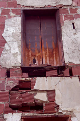
Today, I took a short break from work and walked around Savannah. I have been here for nearly three years and I still enjoy walking the streets. On my street, all the buildings are connected to one another - per block. Sometimes you come to where one has been knocked down. This spot is my fav. There is something very erie about a exposed elevator shaft. Esp. one with large black crows living in it. It reminds me of a early Stephen King novel, erie but draws you in little by little.


Monday, August 08, 2005

*To Volodya*

Who?

The guy
with the elephant neck
and enormous easy honest ears,
with his lip curled down on the words "That's that!"
sticks out the iron chin
of a leader of men,
pushes his way out, breaks out, flies out!
A pilot who laughs
as his plane cracks up in midair
and the gloom of the universe glitters
like an iron bird exploding with laughter.
A soft tender lip, a pouting lip,
a hulk, a hero with five-foot shoulders--
Who is he?
What he does is, over and over,
with a voice that sounds like a smile,
he strikes the blazing match of his wit
on the sole of stupidity's shoe.


V. Khlebnikov,1922


Mayakovsky.com

Sunday, August 07, 2005

Bo-beh-oh-bee is the lipsong
Veh-eh-oh-mee is the eyesong
Pee-eh-eh-oh is the eyebrowsong
Lee-eh-eh-ay is the looksong
Gzee-gzee-gzeh-oh is the chainsong
On the canvas of such correspondences
somewhere beyond all dimensions
the face has a life of its own.


-Khlebnikov

Friday, August 05, 2005


I don’t have a ton of pictures of my mother. Her modesty always shyed her away from any camera. My grandmother had tons of pictures of her as a child and young adult. We have no clue what happened to those pictures after her passing. My sister recently went to my aunt and uncles 50th wedding anniversary and they had a board of pictures up. This one was taken at their wedding. My sister got a shot of it and I will treasure this FOREVER. (My mother is in the snazzy blue dress)